About the Research & Authors
This summary is a simplified educational interpretation of the authors’ original work. All scientific conclusions are taken directly from the paper.
“World Personal Income Distribution Evolution Measured by Purchasing Power Parity Exchange Rates”
by
J.D.A. Islas-García1,
M. del Castillo-Mussot2,
and Marcelo B. Ribeiro3
Affiliations:
Instituto de Ciencias Físicas, Universidad Nacional Autónoma de México (UNAM);
Instituto de Física, UNAM;
Instituto de Física, Universidade Federal do Rio de Janeiro (UFRJ).
Published on arXiv (October 2025)
— Physics and Society (physics.soc-ph) category
Note: This is an independent, educational overview meant to make the original study accessible to a wider audience. It simplifies terminology while preserving the intent and conclusions of the authors. For the full technical paper, visit the official arXiv entry.
Why Study Global Income Distribution?
Over the past few decades, the world economy has changed in ways that deeply affect how wealth and opportunity are shared. In the late 1980s, the global map of income looked like two separate worlds: rich nations on one side, and poorer ones on the other. But since then, something remarkable has happened — millions of people, especially in China and India, have moved from poverty into the global middle class.
The goal of this study is to understand how and why the overall distribution of incomes across the planet has shifted between 1988 and 2018, using comparable data based on purchasing power parity (PPP) — a measure that adjusts for differences in prices and living costs between countries.
By applying mathematical and statistical models to income data from around the world, the authors show that the global income distribution has transformed from a bimodal shape (two peaks — rich and poor) to a more unimodal shape (one larger middle group). This shift tells a bigger story: the rise of a global middle class and a gradual narrowing of gaps between countries — even as inequality within some nations remains.
1988: two worlds
Bimodal Log scale (PPP)In 1988 the global income distribution shows two clear peaks: most people cluster at low incomes (left), while a smaller group sits at high incomes (right). The visible dip between the peaks indicates a thin global middle class.
How to read this chart
- The x-axis is logarithmic: each step right is a large jump in income (PPP-adjusted).
- The height shows the share of people at that income level.
- Two peaks = two clusters of populations (poorer vs. richer countries).
What the data imply (1988)
- A polarized world: many poor, fewer rich, very few in the middle.
- Large between-country gaps dominate the global picture.
- Suggests limited convergence and a small global consumer base.
Schematic only (indicative scale). Bands and peaks are illustrative.
2018: a more continuous world
Unimodal Log scale (PPP)By 2018 the distribution has one broader peak. The “valley” between poor and rich narrows as middle-income groups expand, largely driven by growth in China and India.
How to read this chart
- One peak = most people are closer together in (PPP) income terms.
- The peak shifts right vs. 1988 → higher average real incomes.
- The middle band is wider → more people in the global middle class.
What the data imply (2018)
- Between-country convergence: populous countries (esp. China/India) moved into the middle.
- Global polarization fell, but within-country inequality can still remain high.
- A larger middle class implies broader markets, shifting demand, and new policy challenges.
Schematic only (indicative scale). Trends reflect PPP-adjusted distributions.
Why PPP?
Purchasing Power Parity compares incomes while accounting for the local cost of living. One dollar does not buy the same basket everywhere, so PPP makes cross‑country comparisons fairer.
Key idea
PPP asks how much you can buy locally relative to the U.S.
Benefit
Reduces distortions from exchange rates and price differences.
Caveat
PPP is still an estimate; it can’t capture every quality/access difference.
China and India’s Transformative Role
Between 1988 and 2018, China and India fundamentally reshaped the world’s income landscape. Together, these two countries account for more than one-third of the global population — so even moderate growth in their average incomes produces visible global shifts. The rapid industrialization of China and the steady expansion of India’s service and manufacturing sectors helped move hundreds of millions of people out of poverty.
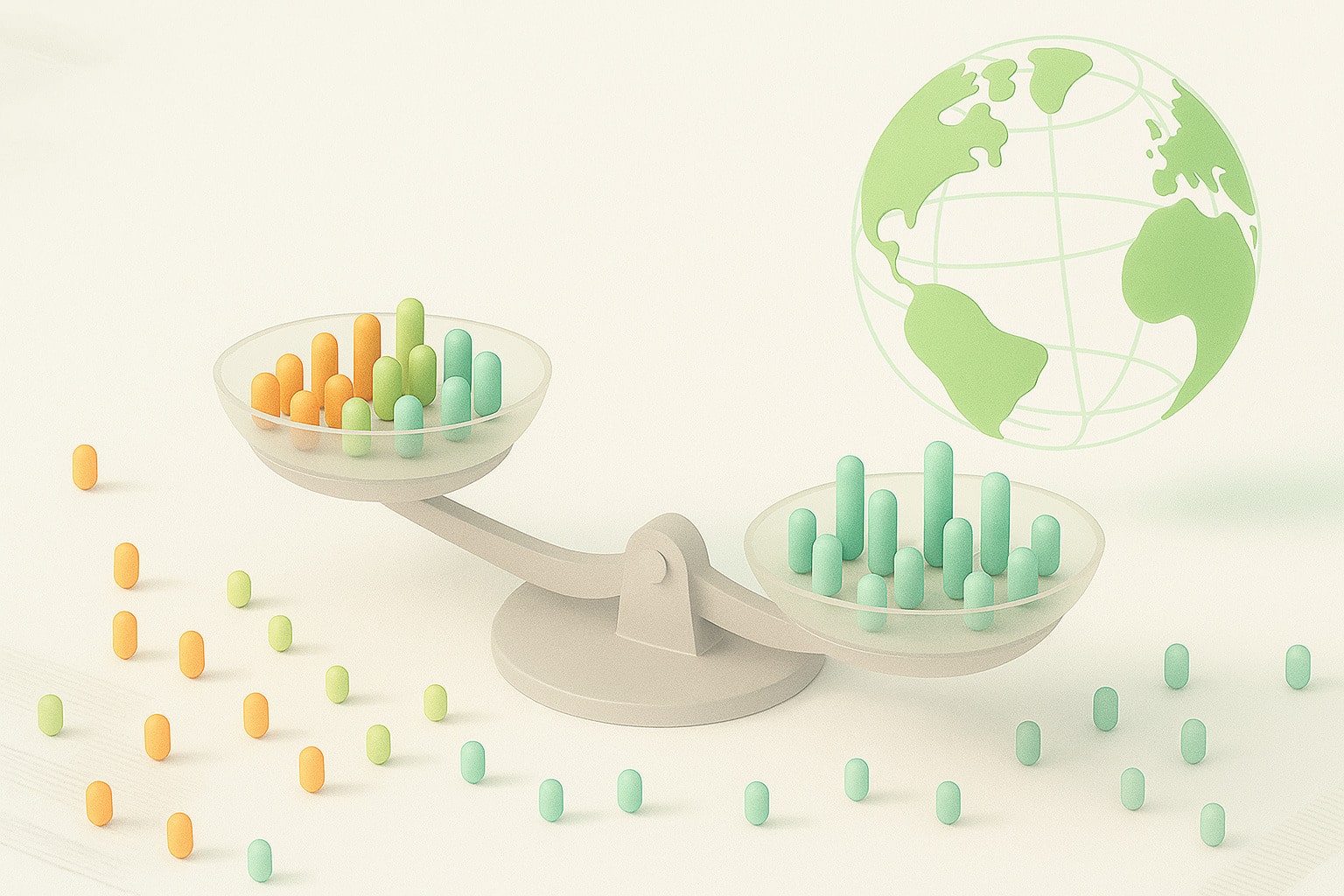
In 1988, both countries were still largely low-income. By 2018, they had created vast domestic middle classes. On a global scale, this change filled the gap between poor and rich nations, turning a two-peak world into one broader middle hump. Without them, the global income distribution would still look hollow in the middle.
Schematic illustration — higher bars show how both nations increased their share of the global middle class.
Understanding China and India’s impact
- China: From the late 1980s to 2018, rapid urbanization and export-driven growth lifted over 700 million people out of poverty. China alone accounts for most of the rise in the world’s lower-middle-income group.
- India: Slower but steady growth, driven by services, IT, and remittances, expanded its middle tier — tens of millions joined the global consumer economy.
- Together, they turned the “missing middle” in the 1988 chart into a wide central plateau by 2018 — visually transforming the shape of global inequality.
The models behind the income curves
To describe the “shape” of world income — how many people fall into each income level — researchers use mathematical models. These models don’t predict individuals, but help fit smooth curves to millions of data points, showing how populations are distributed.
- Log-normal distribution — works well for most people, from low to middle incomes. It assumes that income grows by many small random factors (education, experience, location), so differences multiply over time.
- Gamma distribution — focuses on the lowest end of the scale. It’s useful for modeling countries or groups where small income increases make a big difference.
- Two-distribution mix — combines both to describe a world with two main groups: poorer and richer populations. In 1988 this was essential to capture the “two peaks.”
About the data: strengths and limits
The study uses harmonized household income surveys from dozens of countries between 1988–2018. These surveys are adjusted to PPP (purchasing power parity) to make incomes comparable worldwide.
- Good global coverage: most countries and population groups are included.
- Upper limit: data above roughly $60,000 (2011 PPP) are scarce — the ultra-rich are often under-reported in household surveys.
- Lower limit: the poorest households are also hard to capture due to informal or rural economies.
Despite these gaps, the dataset provides one of the most complete pictures ever of how global incomes evolved. The models smooth out missing data to show the overall pattern more clearly.
Timeline: 1988 → 2018
Why this matters for inequality
- Less global polarization ≠ the end of inequality: gaps can widen within countries.
- The global middle class is a buffer but remains shock‑sensitive (crises, pandemics).
- These methods help measure policy or crisis impacts on income distribution.
Quick glossary
- PPP
- Compares income after adjusting for local prices.
- Log‑normal
- Often fits low/middle incomes.
- Gamma
- Simple model for the lower tail.
- Bimodal
- Two peaks (two groups). Unimodal = single peak.
- CCDF
- Way to look at the “tails” (rare, high incomes).
Conclusion
Between 1988 and 2018, the world’s income landscape transformed dramatically — shifting from a two-pole structure (rich vs. poor) to a more continuous, connected curve. This evolution was driven above all by the rise of middle-income populations in Asia, particularly in China and India, whose rapid economic expansion reshaped the global average.
The study shows that a blend of two statistical distributions best describes this historical transition: one representing poorer economies and another representing richer ones. As growth in emerging countries accelerated, these two worlds gradually merged, forming a single, smoother distribution — the statistical signature of a more unified global economy.
Despite data limitations at the extremes (the ultra-rich and the very poor), the overall picture is clear: the global middle class has expanded and income gaps between countries have narrowed. Yet, inequality within nations often persists — reminding us that global convergence does not automatically mean equal opportunity everywhere. The world may be more balanced than in 1988, but the pursuit of fairness is far from over.